It’s the most wonderful time of the year: Halloween in an election year! ‘Tis the season for a bevy of fright flicks designed to put your girlfriend in your arms and a bad taste in your mouth. Granted, high-art horror, like Antichrist, Pan’s Labyrinth, and The Passion of the Christ, usually do not enter this season’s strategic lineup, but it is good to know that today’s zombies have taken up running because, really, who wants to see a bunch of fat zombies?
This year is special because a multitude of new Americans might very well bring to fruition one-party democracy, much like 20th-century Mexico. Pundits are lauding the Hispanic-American population boom, as if it were an accomplishment akin to putting a flag on the moon or Iwo Jima. Meanwhile, a few bitter white men are expected to vote for the Republican presidential candidate because they have no pity for the new majority.
Halloween season also brings scary stories about falling SAT scores. At Breitbart.com, Ben Shapiro lamented that “2012’s high school seniors have the worst SAT reading scores since 1972; they scored 486 on reading, out of a possible 800.” The Washington Post reported that the scores “reached a four-decade low.” The good news and the bad news are that the elite media are reporting falsehoods, again. Shapiro can take a deep breath because his copy-and-paste error (his Pinker error?) dropped ten points from the actual reading score. However, being too lazy to investigate the scores prior to 1972, the earliest year shown in the annual SAT report, gives the false impression that verbal scores were ever worse than now. In fact, reading scores before Woodstock stood far above the present.
A single year is unlikely to provide a momentous pivot in any of the multiple-decade trends, many of which, it seems, only my readers are aware. It is worth mentioning that the male mathematics advantage slightly grew despite the fact that the upper score limit held down an increased proportion of men relative to women.
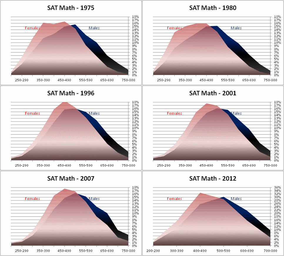
Here are some updated graphs:
SAT examinees mirror the demographic changes in America, but racial score gaps (not counting Asians) declare their constancy. With its gargantuan participation levels of highly engaged students, the SAT offers relatively noise-free output and immunity to the growing criticism of differential motivation confounding IQ tests that lack incentives. Still, Alexander Abad-Santos, at the Atlantic’s blog, promised that the “sweeping assumption that minority test-takers are naturally worse than their non-minority counterparts at the ‘reading’ section doesn’t tell the entire story.” He read this assumption into words that the Post apparently removed from their article that “the declining national reading averages may in part reflect the ever widening pool of students who take the SAT…. Nearly half were minorities….” Abad-Santos seems unmoved by the new numbers. Perhaps the data require a fresh style of presentation—something that fits the spirit of the season. I think back to how the Centers for Disease Control produced an animated graph that defined the obesity epidemic as we know it. America has diversified but not with uniformity. Maybe this calls for a map that illustrates the score changes like an infectious outbreak—or a zombie apocalypse!
Forget the numbers. This night of the testing dread is in full color. White (and light pink) represent superior scores. Red is mid-range. Yellow and the more yellow shades of orange mark the worst states (and Washington, DC, the gold star).



Now, compare those results with this map of the percentage of white and Asian SAT takers out of those who identified their race.

State SAT scores do reflect demographic change, but also test participation. Maine is among the whitest states, but its SAT scores fell when it greatly increased the proportion of students who take the test. Delaware did the same. I have expressed some doubts about the effects on scores of participation rates for various groups, but racial and gender groups cannot achieve total participation in a test, like states can. That phenomenon pushes students to take part regardless of their ability or desire to attend college. Midwestern states seem to fare best, but those states emphasize the ACT rather than the SAT. In a state like Illinois, which currently has 100% ACT participation and 5% SAT participation among high-school graduates, a student who takes both tests probably outperforms most of his or her classmates. That student may want to take the SAT to apply to a more prestigious university outside the region.
According to the Washington Post, “questions about whether the SAT is biased in favor of middle-class and wealthy students have led many colleges and universities to use other gauges or to accept an alternative exam, the ACT, which edged out the SAT in 2012 for the first time…” With regard to racial groups, ACT scores act just like those of the SAT.
The ACT even had the same surge of people who would not respond to the racial identity question, except ACT non-responders peaked in 2007 instead of 2003.
Over the years, African Americans, Hispanic Americans, and Native Americans have fallen further behind whites on the ACT.
The map of ACT scores does show a developing North-South divide somewhat like the demographic map. However, it mostly looks red because the District of Columbia used to be such an outlier. Likewise, certain New England states with low ACT participation served as outliers at the other end.

To better account for state test preferences, I created a composite SAT-ACT map. I designed a crude linear formula based on a conversion table to convert ACT scores to SAT equivalents. Then I weighted each of the two tests according to the relative participation for each state. In accordance with the conversion table, I did not consider writing scores.

I consider this the best and most reliable map, but participation issues limit even it. I controlled for the relative participation between the tests, but not for the overall participation rates. The states that moved to total or near total participation on one of the tests were Colorado, Delaware, Illinois, Kentucky, Louisiana, Maine, Michigan, Mississippi, North Dakota, Tennessee, Utah, and Wyoming. Only Delaware and Maine have chosen to go with the SAT. By contrast, Arizona sticks out for its extremely low participation on both tests. Clearly, Arizona has an unfair score advantage, and Iowa and California also do not have especially high testing rates, either. I decided to program a map that punishes the scores of states in which the combined participation percentages of both tests is less than 100% by a factor proportional to its deficit below 100%. The punishment is somewhat arbitrary and probably quite excessive, but at least it shows that the American Southwest has inflated scores. I consider this neither to be a “score” map nor truly “controlled,” so I reset the color ranges.

For clarity, here is a map just of the addition of the participation percentages for both tests without regard to scores. States like Florida are seeing high rates of participation on both tests because they have not settled upon a single standard.
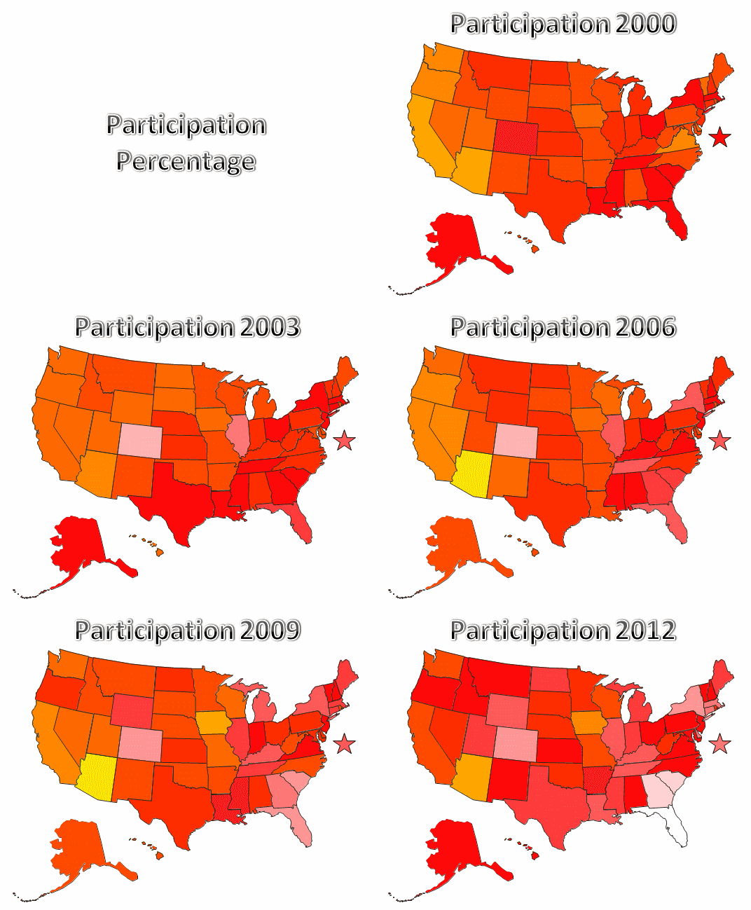
State participation changes confound state scores in multiple ways, but a movement towards full participation on the ACT could settle this issue. States increasingly seem to favor the ACT over the SAT, which I suspect is partly due to the false impression that ACT scores are less racist. Demographic changes correspond to falling test scores, and one can see it, at least in terms of a North-South divide, on these maps. America is bearing a zombie apocalypse, which is sweeping the nation and coming for our brains.
Duckworth AL, Quinn PD, Lynam DR, Loeber R, & Stouthamer-Loeber M (2011). Role of test motivation in intelligence testing. Proceedings of the National Academy of Sciences of the United States of America, 108 (19), 7716-20 PMID: 21518867


13 comments:
Thanks.
I've been looking for a combined SAT/ACT study for a long time.
However, the flashing maps are too much info to take in. Can you add table versions of the the last few maps, with just the latest year?
You might compare these to NAEP scores to see if your adjustments are making sense.
Another graph would be a line chart over the years of the SAT/ACT composite adjusted for participation.
A big methodological issue is that both SAT and ACT participation has been increasing for two reasons:
- Scraping the bottom of the barrel harder
- Testtakers trying both tests to see if they'll do better on one than the other.
This is a big problem for disentangling unless the two organizations have shared data in a specific study.
For example, to eliminate the effect of bottom of the barrel scraping, we could look at absolute numbers of high scores as they change over time. I'd be interested in seeing how the absolute number of people scoring 700 or higher (or its ACT equivalent) have changed over the years because surely virtually everybody who could score a 700 was taking one of the two tests. But, there has probably been a big increase in recent years of individuals scoring highly on both tests, which leads to doublecounting.
Any suggestions for how to deal with this?
I think the weighting formula that I used for the composite scores effectively controlled for most of the effect of students who take both tests, especially in states that have a clear preference. It could be improved slightly with a complex non-linear formula for ACT conversion that conforms to the conversion table. The effect of scraping the bottom of the barrel can be mostly controlled by either ignoring states that have very high or very low participation or by only looking only at the 12 states (and growing) with universal (or near universal) testing. Many of the latter group are adopting the ACT as a high school exit exam.
State SAT-ACT Composite, Participation Controlled, Participation
Alaska 496 441 89
Alabama 461 434 94
Arkansas 459 423 92
Arizona 476 295 62
California 501 400 80
Colorado 478 478 117
Connecticut 514 514 115
DC 457 457 114
Delaware 465 465 114
Florida 467 467 136
Georgia 479 479 133
Hawaii 485 451 93
Iowa 499 329 66
Idaho 497 433 87
Illinois 474 474 105
Indiana 498 498 101
Kansas 497 432 87
Kentucky 451 451 106
Louisiana 462 462 109
Massachusetts 525 525 112
Maryland 498 473 95
Maine 476 476 102
Michigan 456 456 104
Minnesota 517 419 81
Missouri 490 392 80
Mississippi 425 425 104
Montana 506 450 89
North Carolina 497 437 88
North Dakota 467 467 103
Nebraska 497 413 83
New Hampshire 525 493 94
New Jersey 509 499 98
New Mexico 461 406 88
Nevada 486 403 83
New York 499 499 119
Ohio 500 450 90
Oklahoma 469 399 85
Oregon 505 479 95
Pennsylvania 497 457 92
Rhode Island 494 405 82
South Carolina 470 470 130
South Dakota 492 413 84
Tennessee 453 453 110
Texas 478 478 101
Utah 469 469 103
Virginia 508 493 97
Vermont 519 503 97
Washington 521 412 79
Wisconsin 500 375 75
West Virginia 471 400 85
Wyoming 460 460 105
Okay, thanks.
But, I don't really believe that if every teenager in Texas took the SAT or ACT they'd score 478 on the SAT but in Arizona they'd score 295. A 101 participation rate in Texas means something like 60% took the ACT and 41% took the SAT, but the percentage that took either one is something like 65%. I'm pretty baffled how to adjust for this.
The bigger question an adjustment could be used for is the national trends over time.
You have a good point, but you could just ignore most of the states. If you look at the states that adopted one of the tests for universal or near-universal testing, Colorado, Illinois, and Maine are the best of the twelve. Mississippi is worst. Arizona has the same score as the best with a small fraction of the participation. Therefore, Arizona deserves to be "punished." I do wish that I had a better way to account for participation differences. The trend is towards adoption of state standards, so the problem could resolve itself.
Here's an idea -- look for discontinuities in annual participation rates in states that changed the law and see what impact that had on scores. If a state goes from 60% to 100%, in one or two years, what does that do to average scores?
My impression is that the impact is surprisingly minor, perhaps because the really dumb kids already dropped out of high school.
My attempt to punish Arizona was obviously excessive, but the score drops with state test standard adoption do not strike me as minor. Here are the significant, single-year participation changes: Colorado’s ACT participation went from 62% to 99% in 2002, and its ACT score fell from 21.5 to 20.1. (SAT-ACT composite fell from 501 to 472.) Illinois went from 71% to 99% in 2002 with a drop from 21.6 to 20.1 (498 to 464). Kentucky went from 72% to 100% in 2009 with a drop from 20.9 to 19.4 (478 to 444). Michigan went from 70% to 100% in 2008 with a drop from 21.5 to 19.6 (492 to 448). Utah went from 73% to 97% in 2012 with a drop from 21.8 to 20.7 (493 to 469). Maine SAT participation went from 73% to 100% in 2007, and its SAT-ACT composite fell from 501 to 469. Delaware went from 74% to 100% in 2012, and its SAT-ACT composite fell from 492 to 465. In fact, Arizona’s ACT participation more than doubled between 2009 and 2011 from 15% to 34% with a similar drop from 21.9 to 19.7. (The SAT-ACT composite went from 508 to 474 as SAT participation went from 26% to 28%.)
That's fascinating stuff.
So from this we can calculate the average score of the incremental test takers. For example, in Illinois, when 71% took the SAT, the average was 21.6, but when 99% took it, the average fell to 20.1. So, all else being equal, that means the incremental 28% averaged a 17, which is 4.6 points lower than what the 71% averaged, and 4.6 is pretty close to one standard deviation.
If the additional 28% came from the bottom of the distribution, the 2nd to 28th percentiles, then the median of the incremental test takers would be about the 14th or 15th percentiles overall, while the median of the previous 71% would be about the 64th percentile. That would imply a drop of around 6 to 6.5 points, maybe, but instead the drop was about 3/4ths of that. So, some of the incremental scorers came from above the bottom 28% -- although not too many.
It would be interesting to see if this law made any measurable increase in high scorers (above 30 or above 25) and which race they most came from. I'm betting offhand that the law rousted more semi-smart white kids into taking the ACT than other races. Probably kids who were set on going into the Army and had done well on the AFQT, that kind of thing.
It would be interesting to see if this law made any measurable increase in high scorers (above 30 or above 25) and which race they most came from. I'm betting offhand that the law rousted more semi-smart white kids into taking the ACT than other races. Probably kids who were set on going into the Army and had done well on the AFQT, that kind of thing.
Above 25, white boys, maybe some Hispanic boys. Above 30 a few white boys, mostly in reading and writing.
I'd be interested in seeing how the absolute number of people scoring 700 or higher (or its ACT equivalent) have changed over the years because surely virtually everybody who could score a 700 was taking one of the two tests. But, there has probably been a big increase in recent years of individuals scoring highly on both tests, which leads to doublecounting.
You wouldn't want to use the SAT for this unless you started after 2005. The ACT would be best.It was the first test used statewide, and has made no changes to format.
Odd note: the ACT's English score grading has gotten tougher over the past two years---probably because the increase in top tier testers.
Since state reports do not go back that far, I cannot answer that for Illinois in 2002, but I can for Utah in 2012. Overall participation jumped from 73% to 97%. Both those scoring above 30 and above 25 increased in raw numbers but fell as a percentage (from 4% to 3.5% and from 22% to 19%, respectively). The data shows a bell curve that slightly shifted. Each of the two years has a single peak. The percentage increase of white test-takers was 9%. For Asians, it was a drop of 4%. Hispanics increased 28%. Blacks increased 14%. The reports show the percentage of each racial group meeting the “college readiness benchmark scores,” which were 18 for English, 22 for math, 21 for reading, and 24 for science. Asians held steady at 27%, whites fell from 29% to 27%, Hispanics fell from 11% to 8%, and blacks fell from 9% to 4%. I interpret this to probably mean that Asians already had high participation, but the adoption of the state standard forced less prepared students from the other groups to take the test. Hispanics increased in number more than blacks, but their scores did not fall as much because more Hispanics are immigrating and because more Hispanics perform better than do blacks among those who do not go to college. It makes sense to expect that recent Hispanic immigrants underutilize education, relative to blacks.
Thanks, for Utah, how large were the increases in higher scorers in absolute terms (or relative to the entire cohort?) In other words, can we see enough diamonds in the rough being discovered to actually count them, or is just washed away by raw noise?
Here are the numbers for each score. Race data in this detail are not available. Based on the relative score declines, I would say that the largest number of “diamonds in the rough” are probably white, but Hispanics would probably not be nearly as lacking as blacks.
Score 2011 2012
36 5 9
35 49 69
34 112 136
33 168 219
32 266 302
31 414 430
30 578 601
29 656 743
28 902 990
27 1089 1260
26 1299 1505
25 1560 1623
24 1799 1860
23 1837 1984
22 1950 2203
21 2064 2329
20 1987 2411
19 1885 2315
18 1802 2259
17 1402 2044
16 1111 1888
15 849 1735
14 661 1437
13 412 1208
12 206 802
11 80 357
10 13 79
9 4 28
8 0 3
7 0 4
6 0 1
5 1 0
4 0 0
3 0 0
2 0 1
1 0 0
Hello, I simply wanted to take time to make a comment and say I have really enjoyed reading your site.
Post a Comment